
Typographic Book
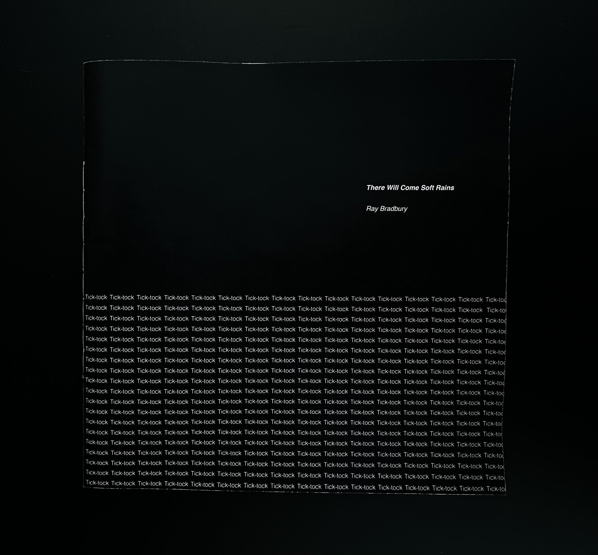
This book project features various typographic layouts for a short story. The short story “There Will Come Soft Rains" by Ray Brad Berry contains writing elements of symbolism, foreshadowing, and repetition to create suspense. The beginning of the book is calm, orderly, and light, while the climax is dark and chaotic. The typographic layouts reflect these literary elements that Brad Berry uses to create tonal changes and suspense.


A Closer Look
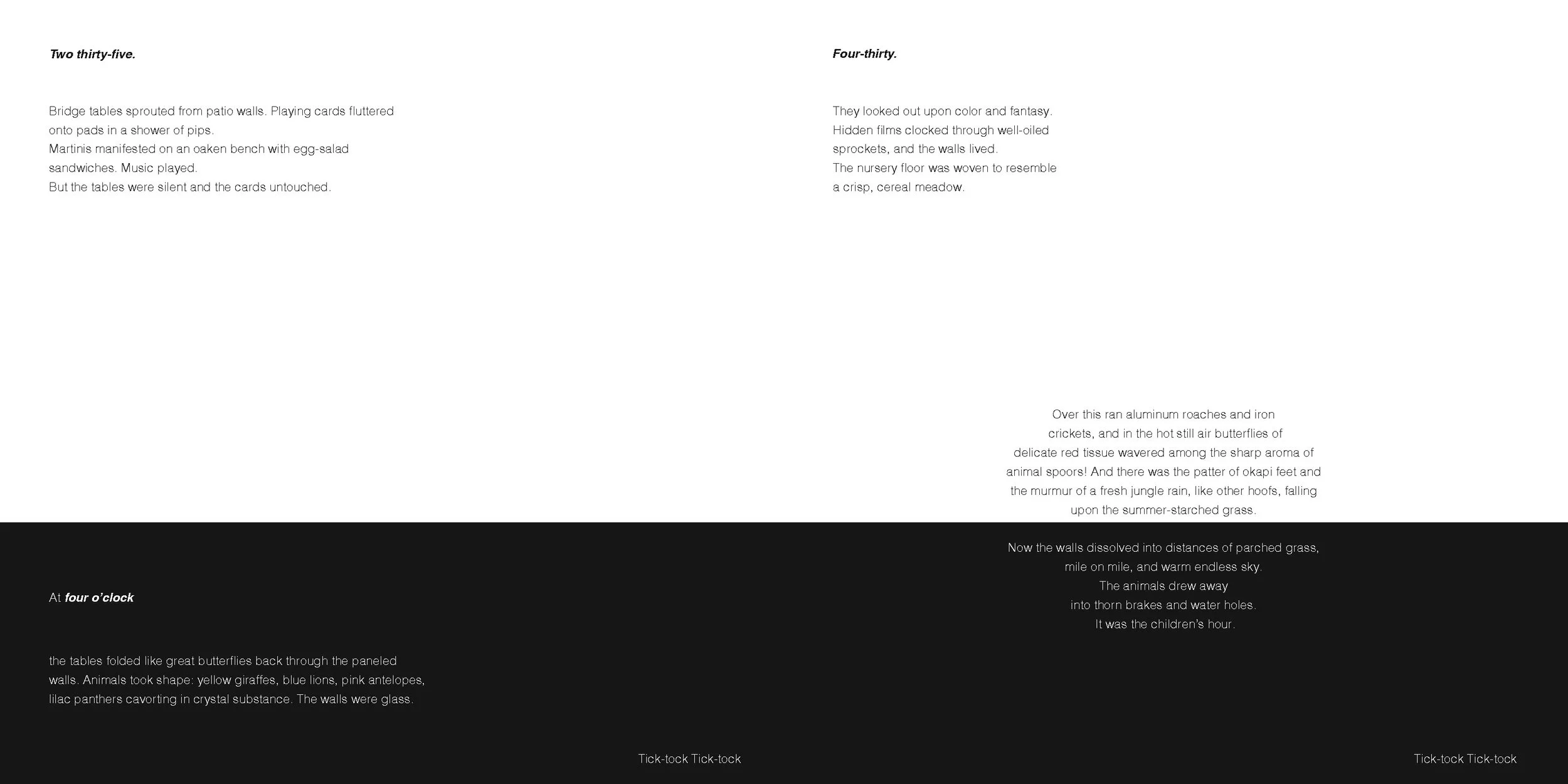
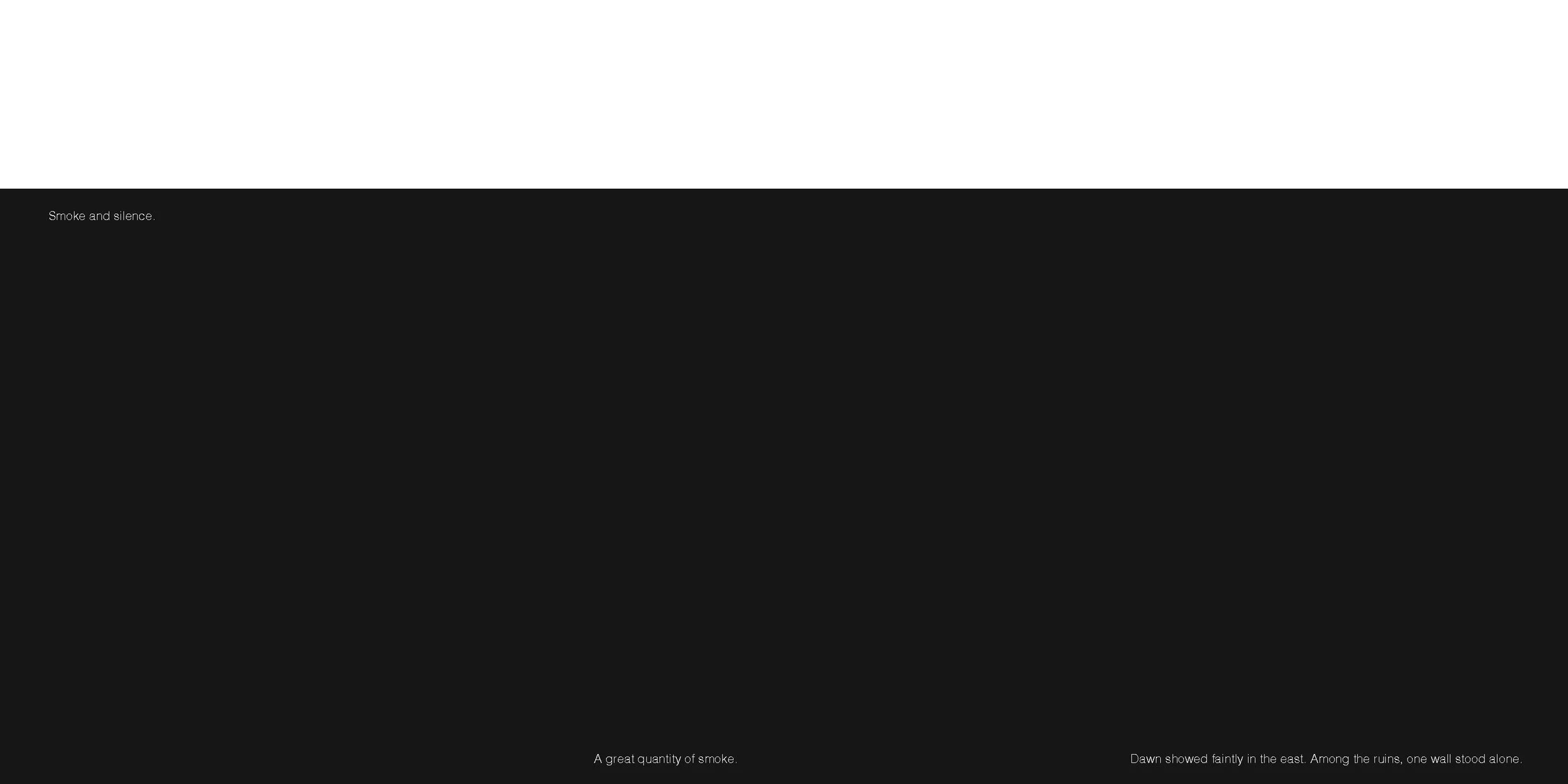
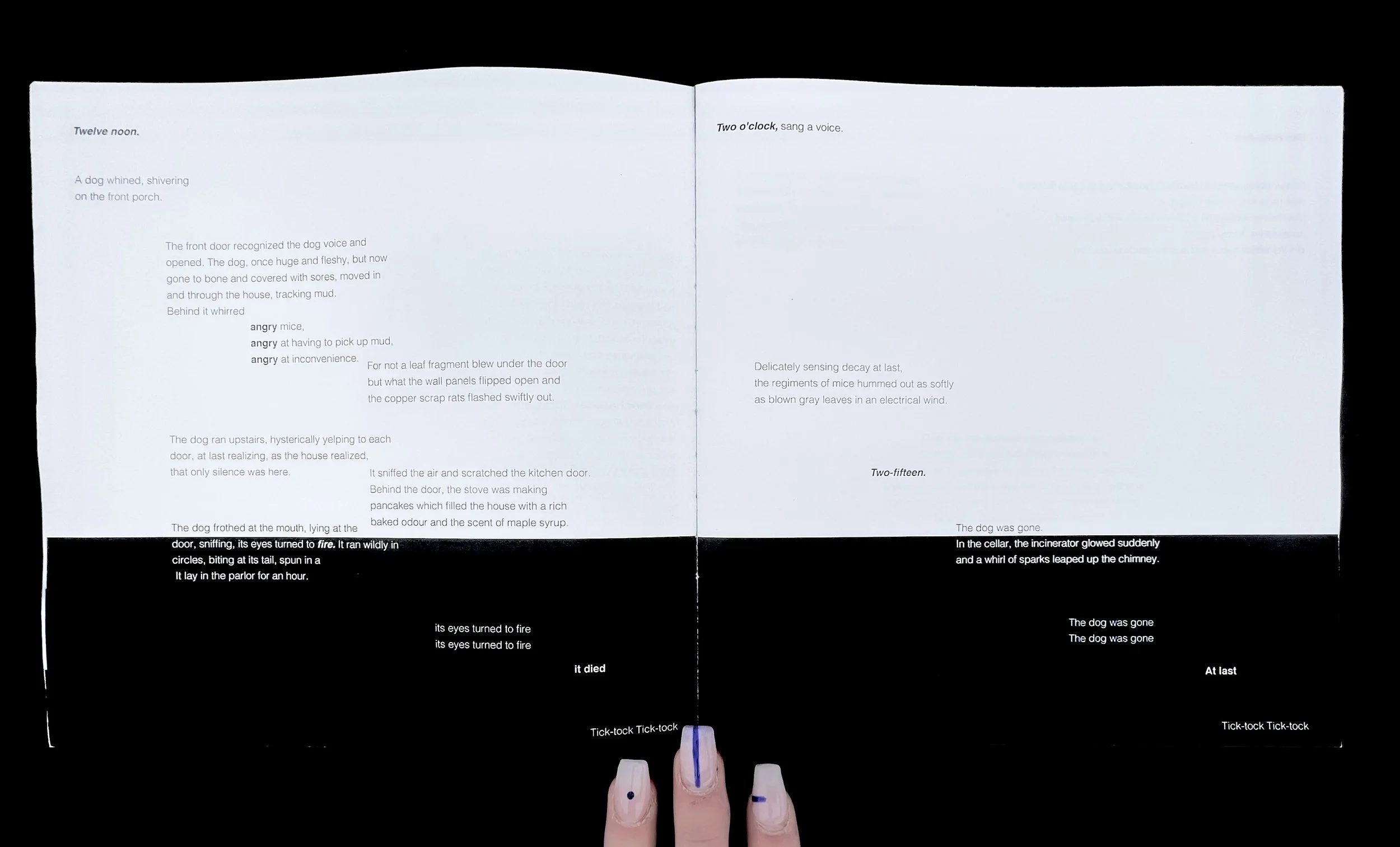
There Will Come to Soft Rains consists of many interpretative themes, one of which is nature vs technology. This is the main theme of the short story and is used to help establish the setting of the story, a futuristic house that does everything for you. However, there is no one inside the house. Indirectly, we learn that this may have been due to an atom bomb. This references the cold war, which is around the time this was written.
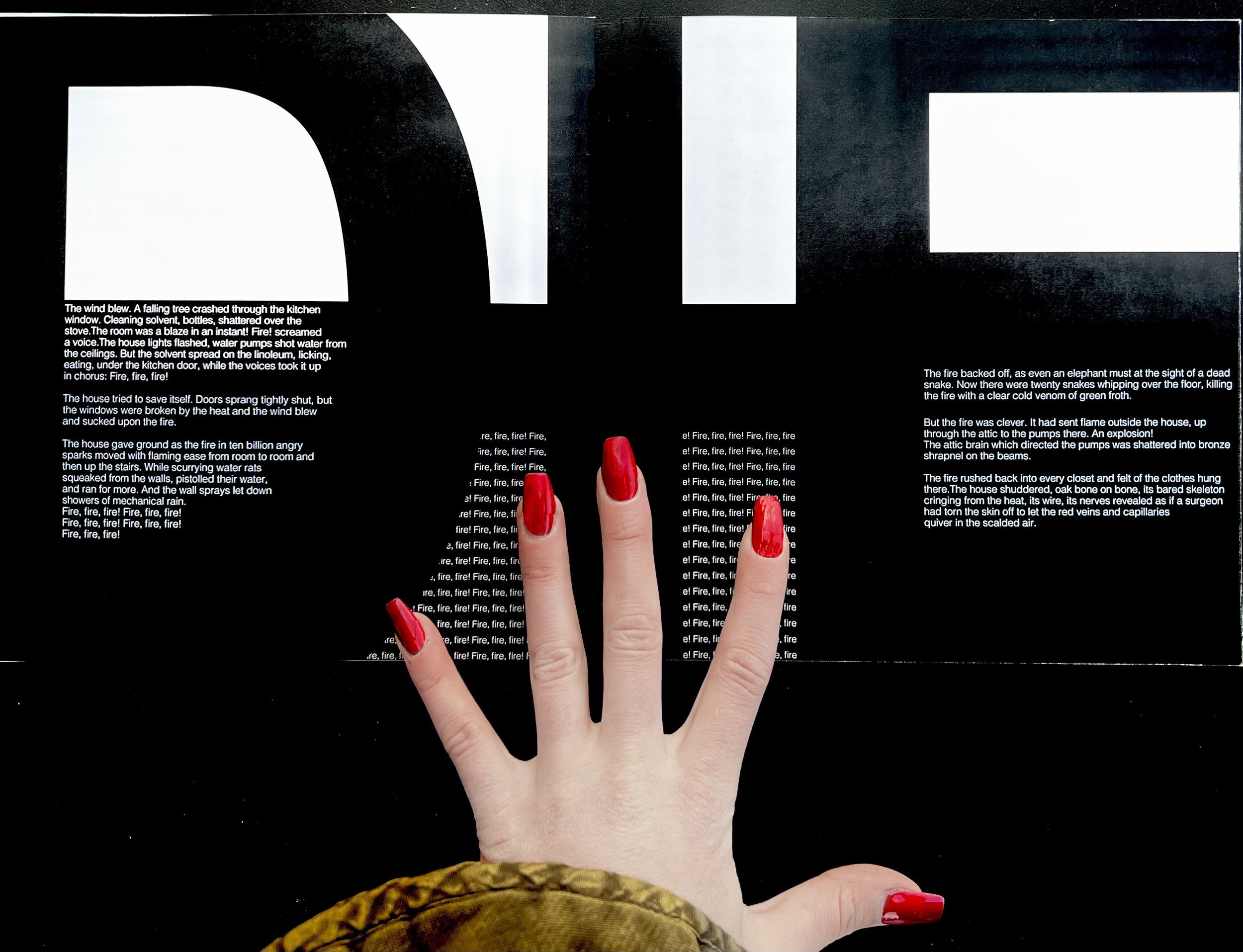
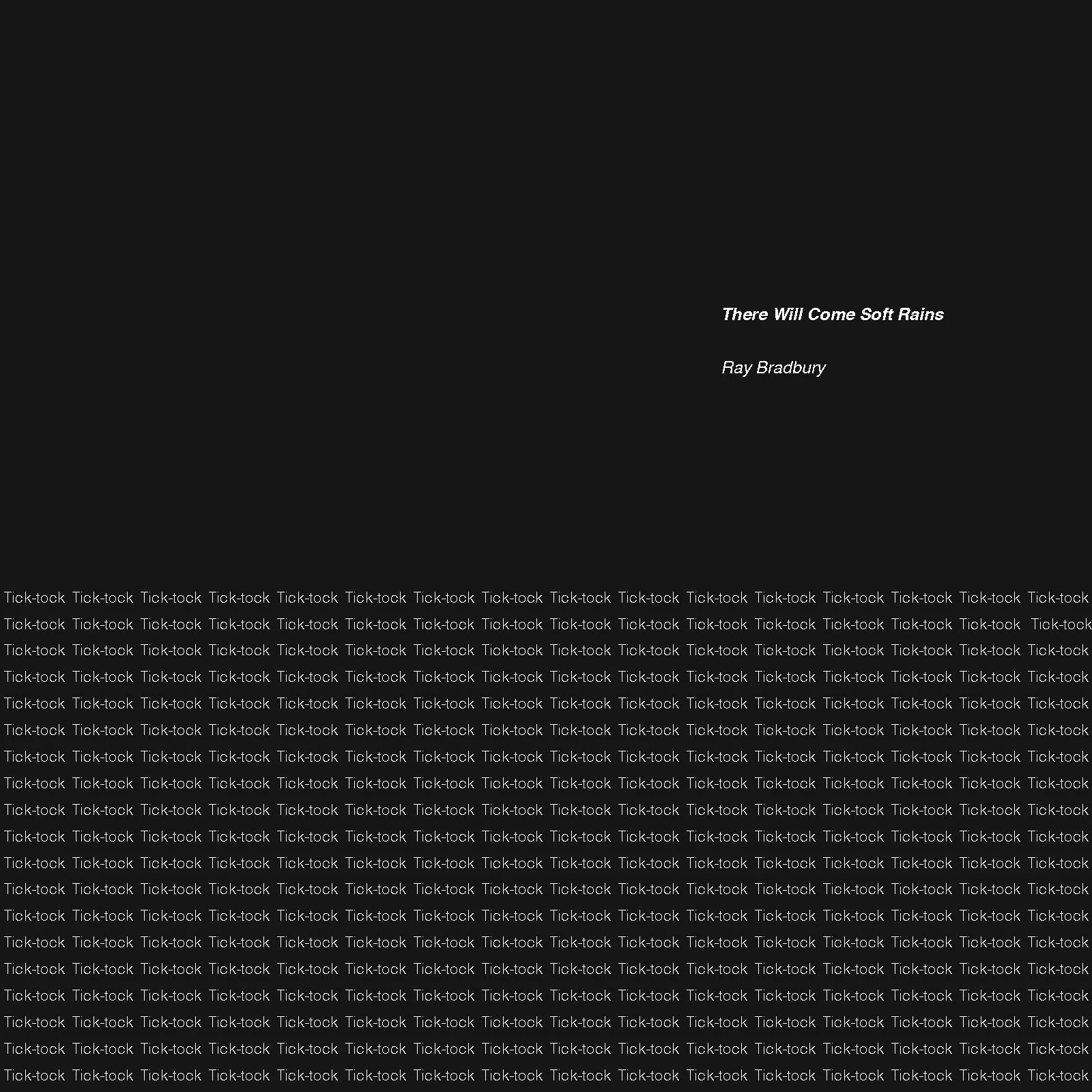
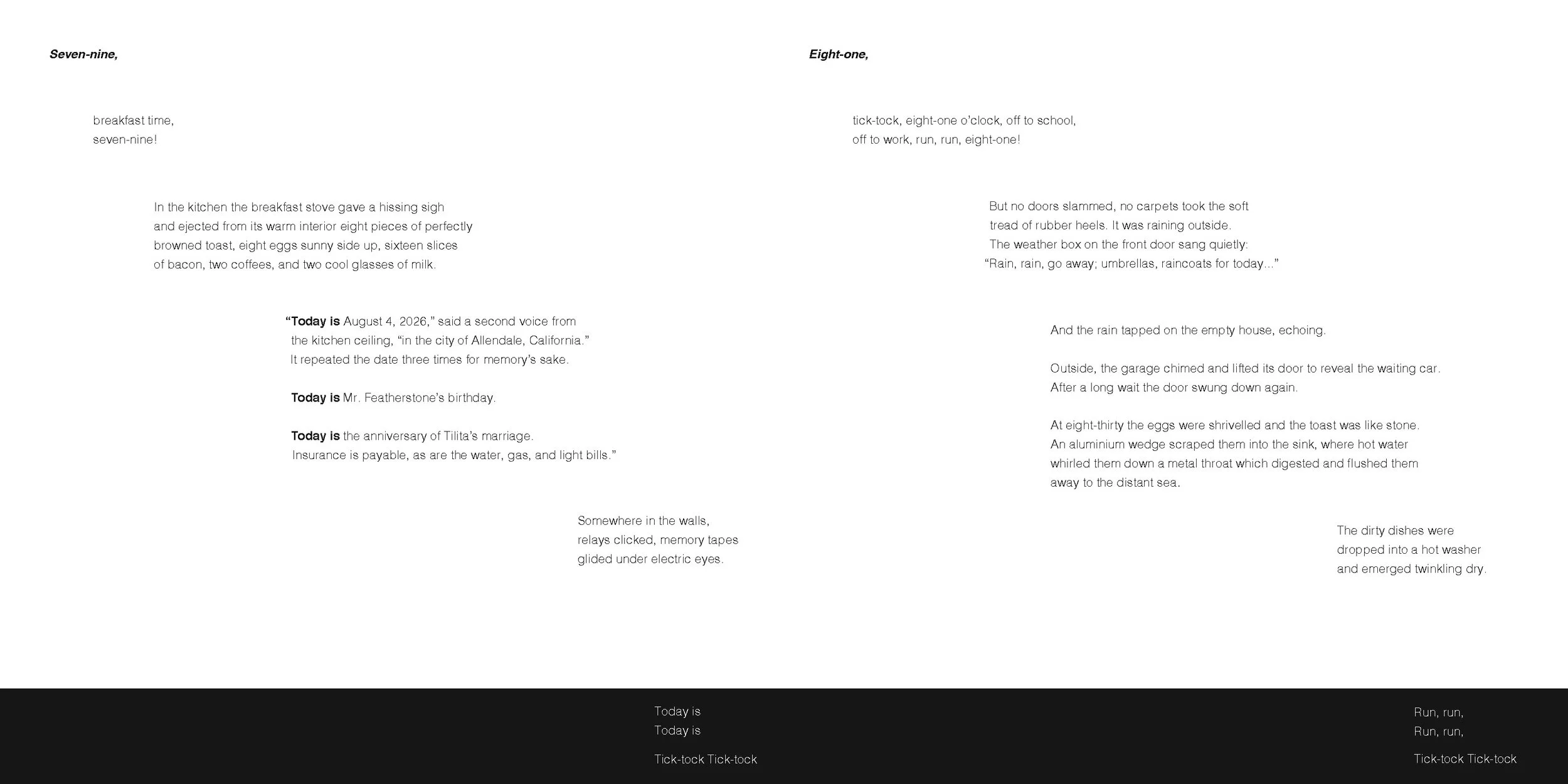
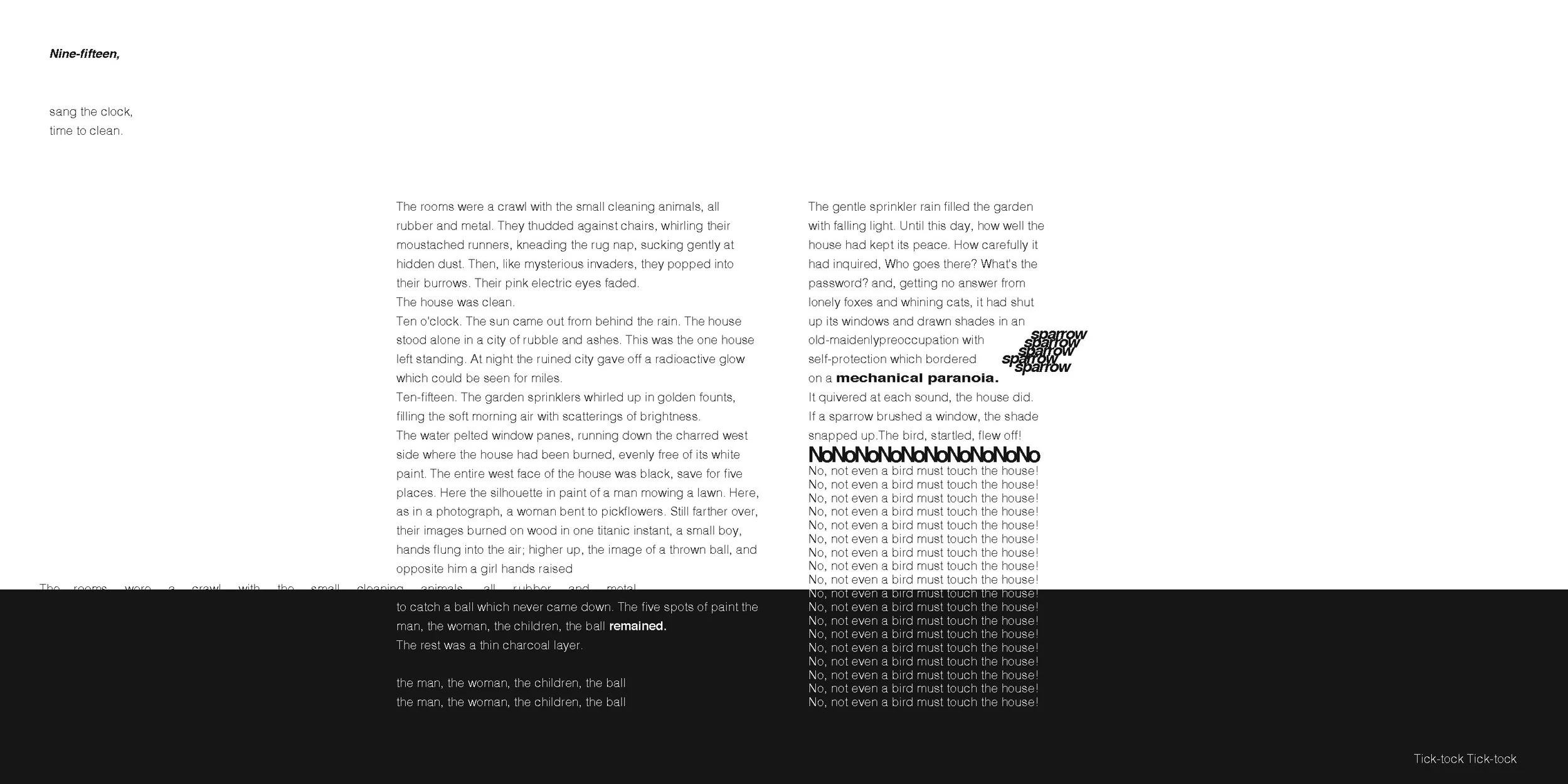
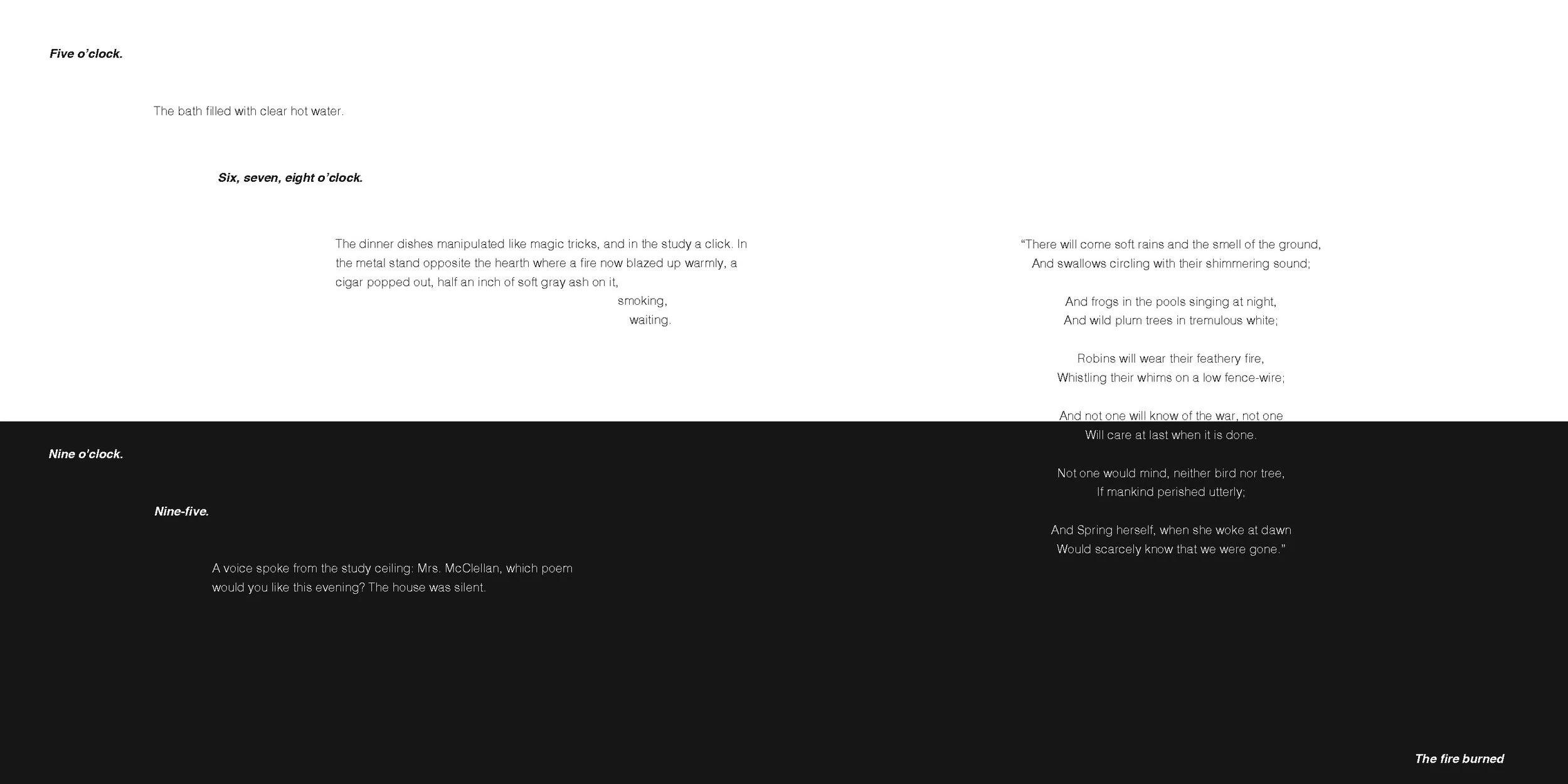
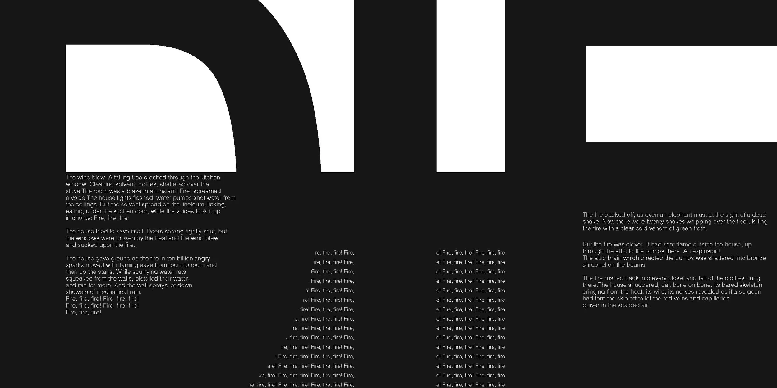
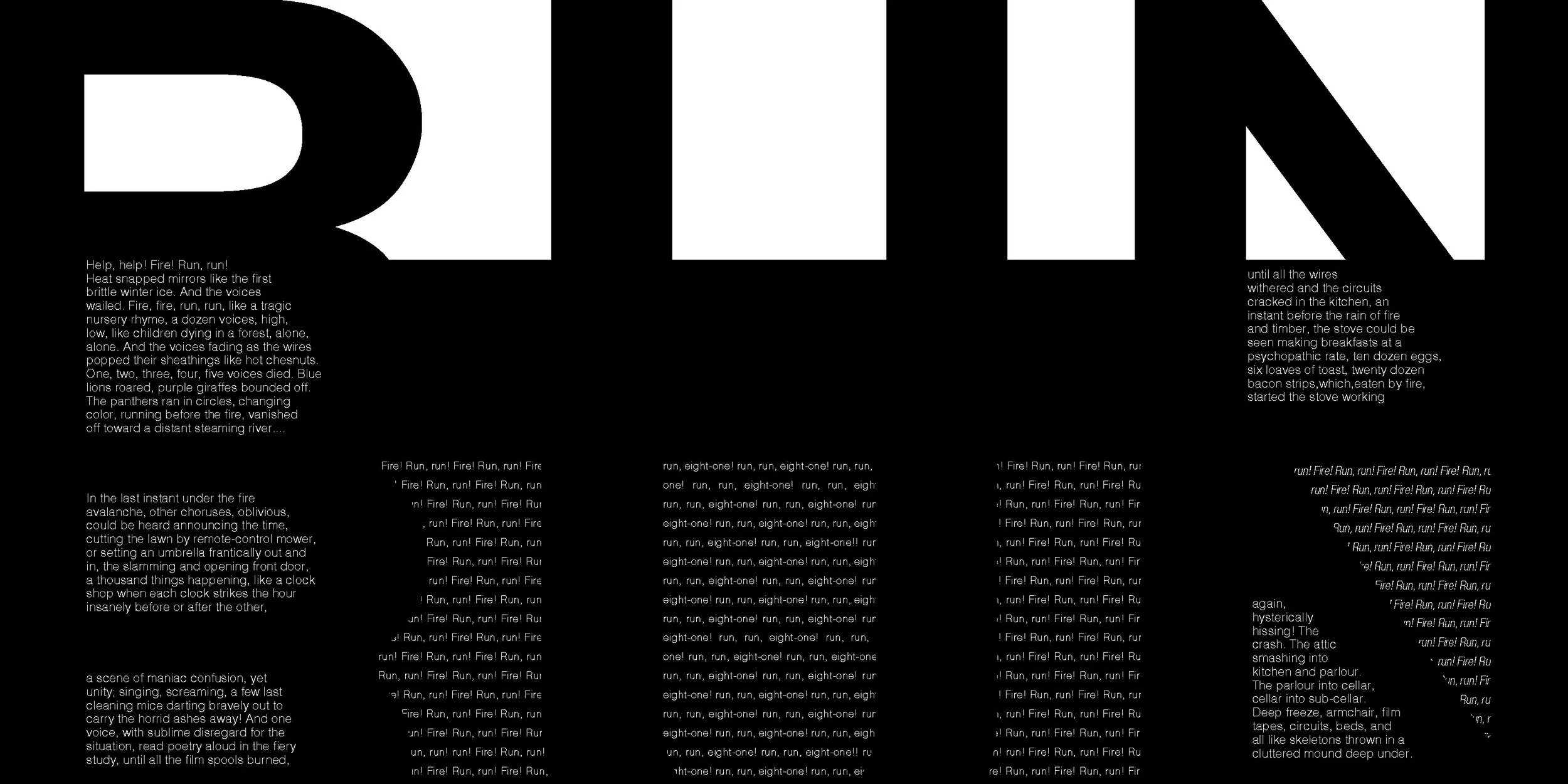
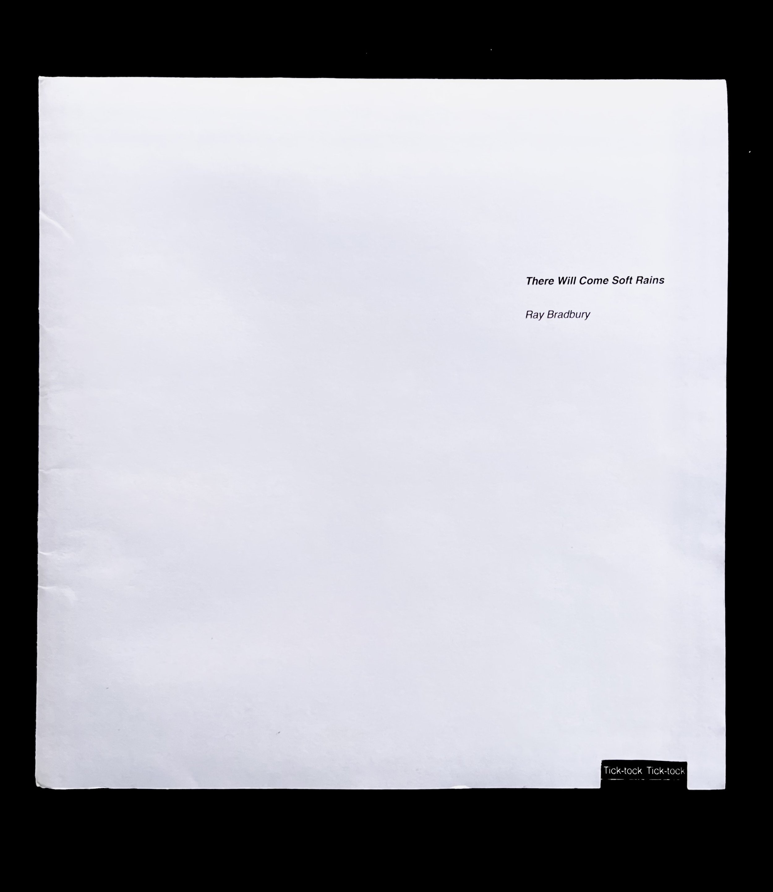
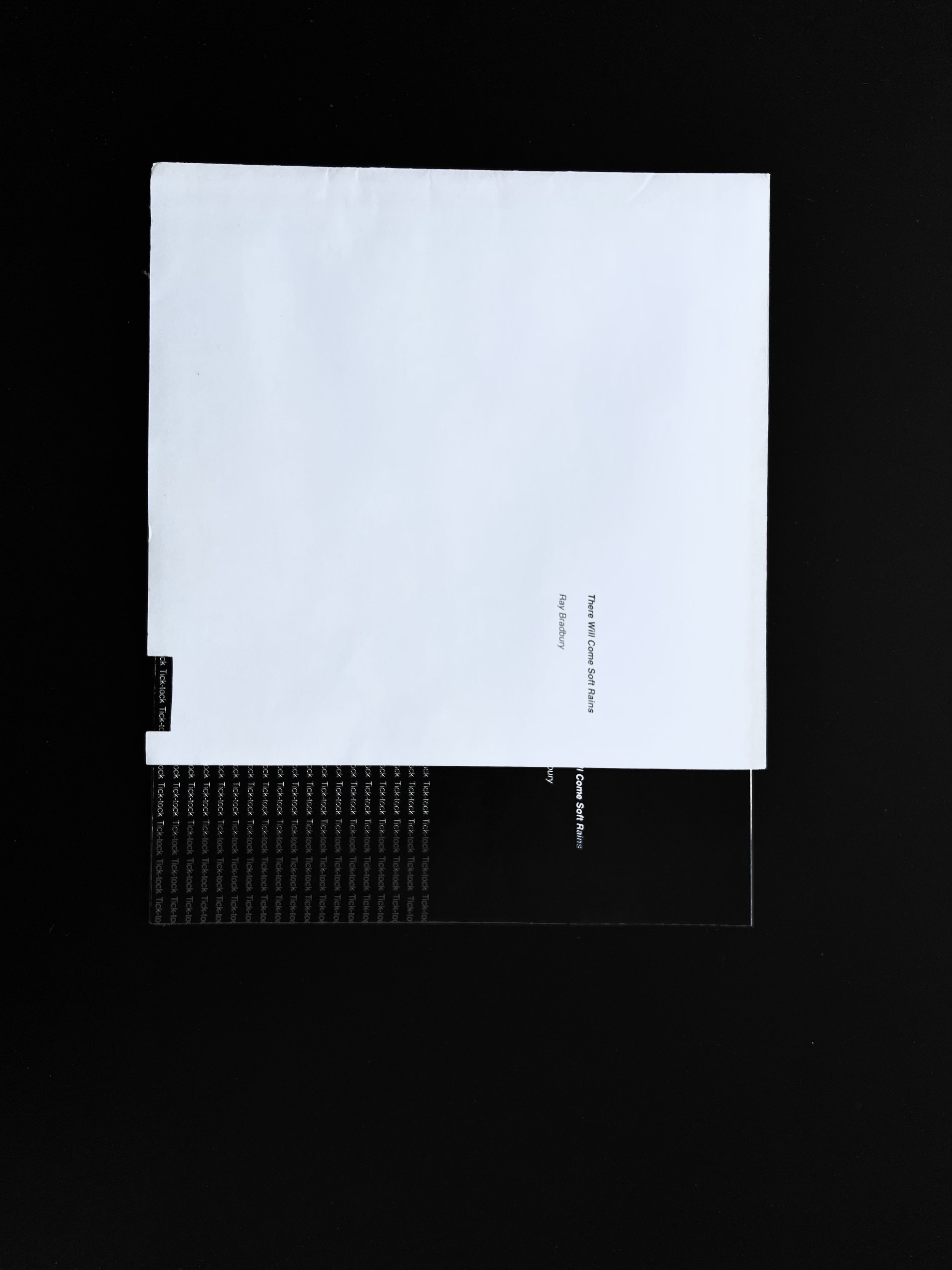
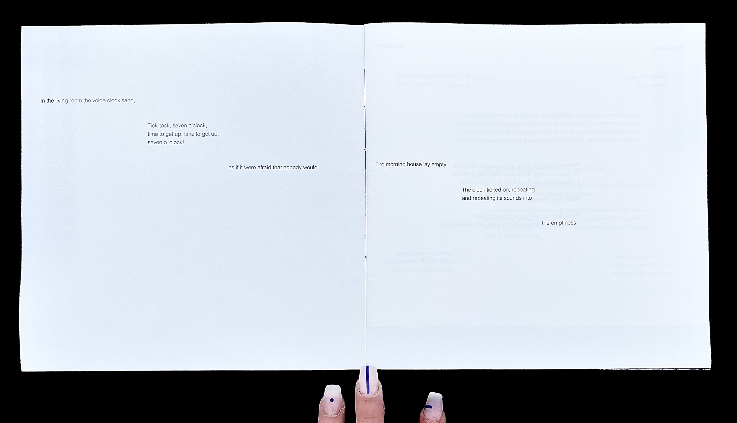
For the design of the book, elements of visual foreshadowing and repetition are used to emphasize these elements shown in the short story. Black represents nature and white represents technology, we see the white calm pages slowly fill with black as the story reaches the climax. Shown in this photo here, is what is at the bottom corner of every page of the rising action of the short story, tick-tock tick-tock. This helps emphasize the build-up to the climax and references back to the atom bomb. A texture is created with the repetition of the word tick-tock for the climax of the page with “DIE”. The word “die” is the end of the previous page “The house began to”. This texture resembles rain to emphasize the irony of the rain referenced in the title vs the climax, a fire burns down the house.